Héritage et réinterprétations typographiques
(FR)
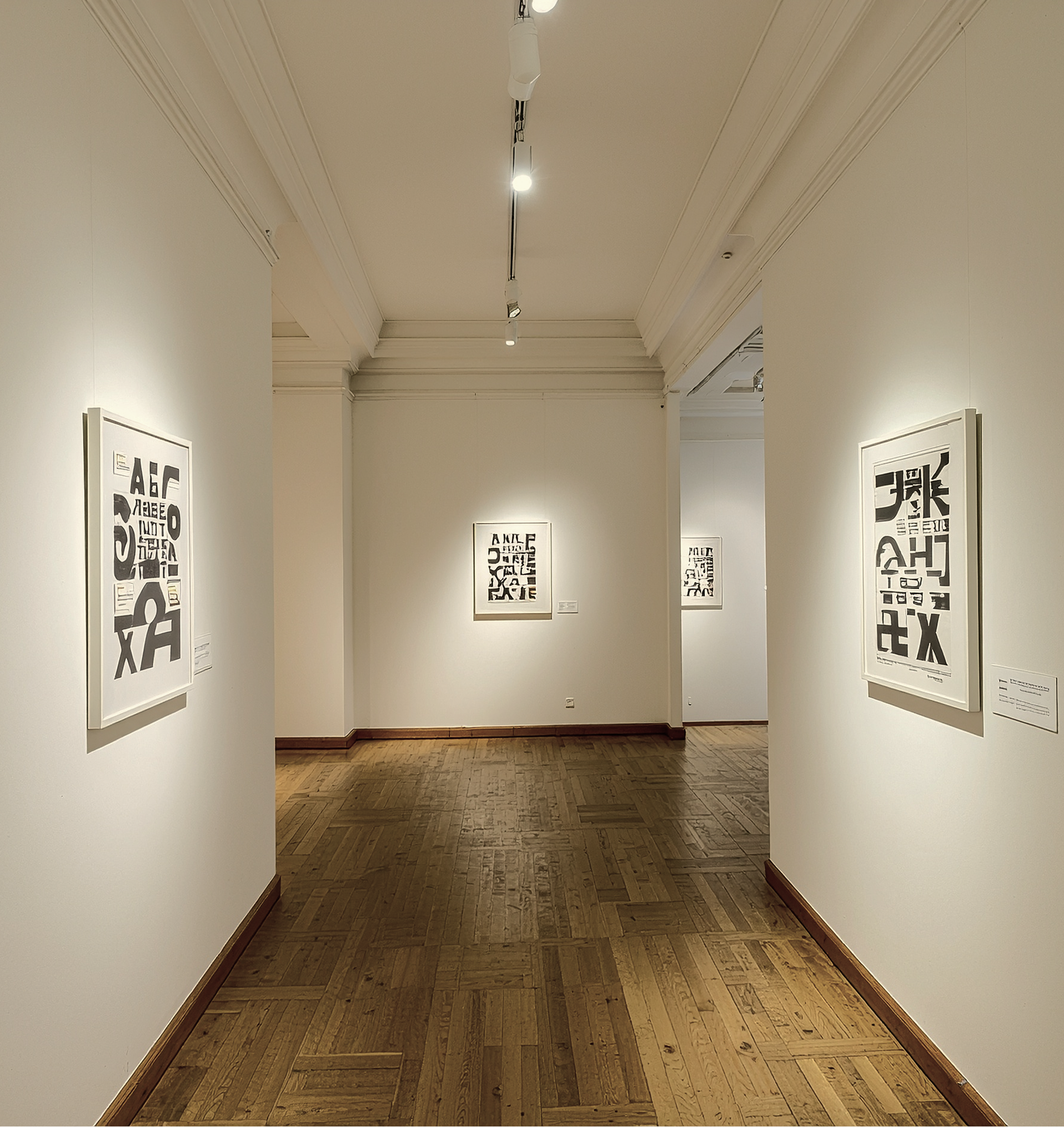
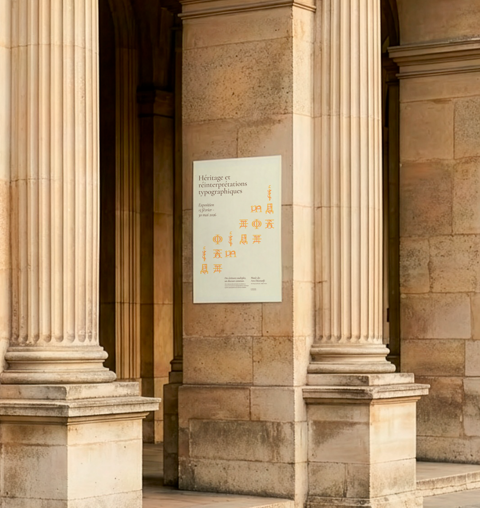
Enosis est un collectif engagé pour la valorisation et la reconnaissance des arts ethniques, organisant tout au long de l’année des expositions thématiques. Héritage et réinterprétations typographiques est une exposition visant à promouvoir les créations de caractères internationaux à travers des travaux graphiques réalisés par des designers émergents du monde entier, membres du réseau du collectif. Au-delà de la mise en valeur de la singularité des différents systèmes d’écriture, l’exposition propose un regard nouveau et cosmopolite sur la création typographique contemporaine.
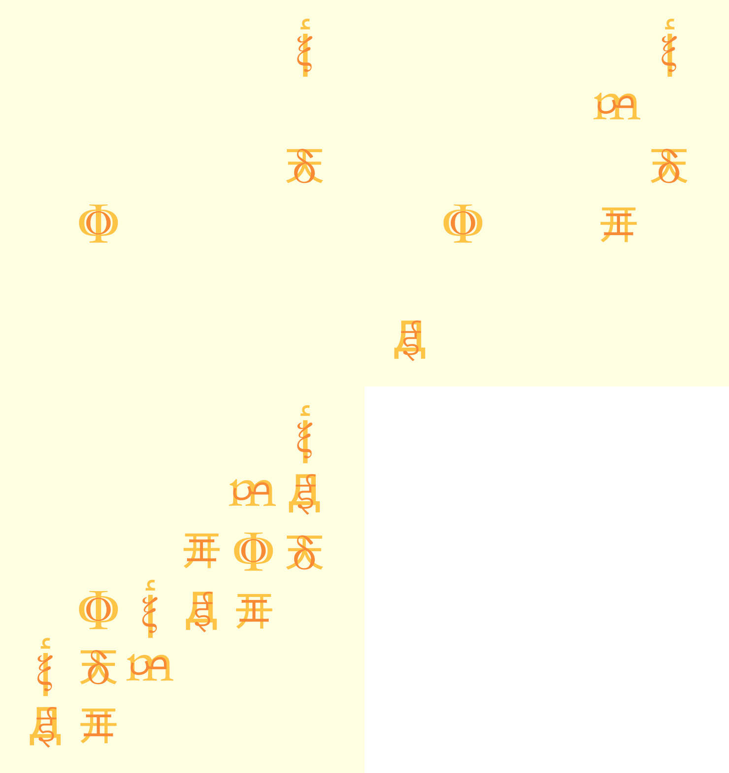
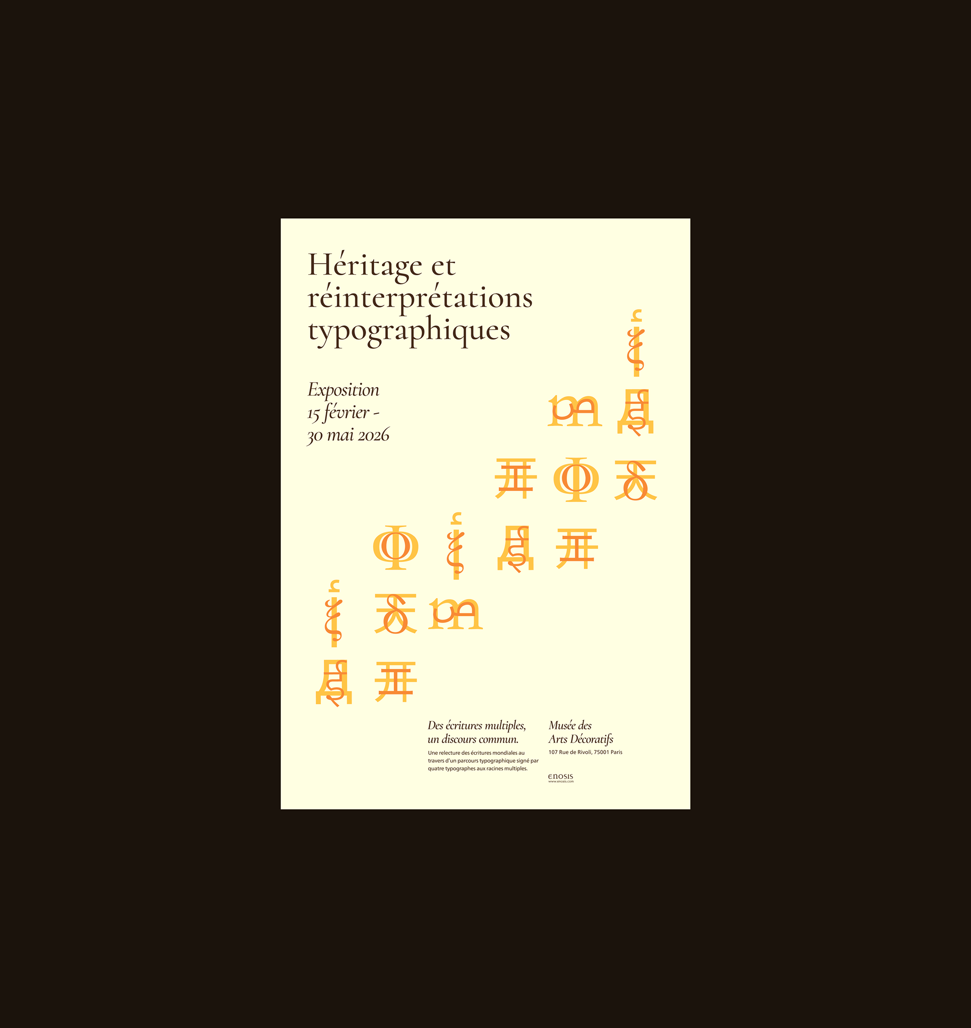
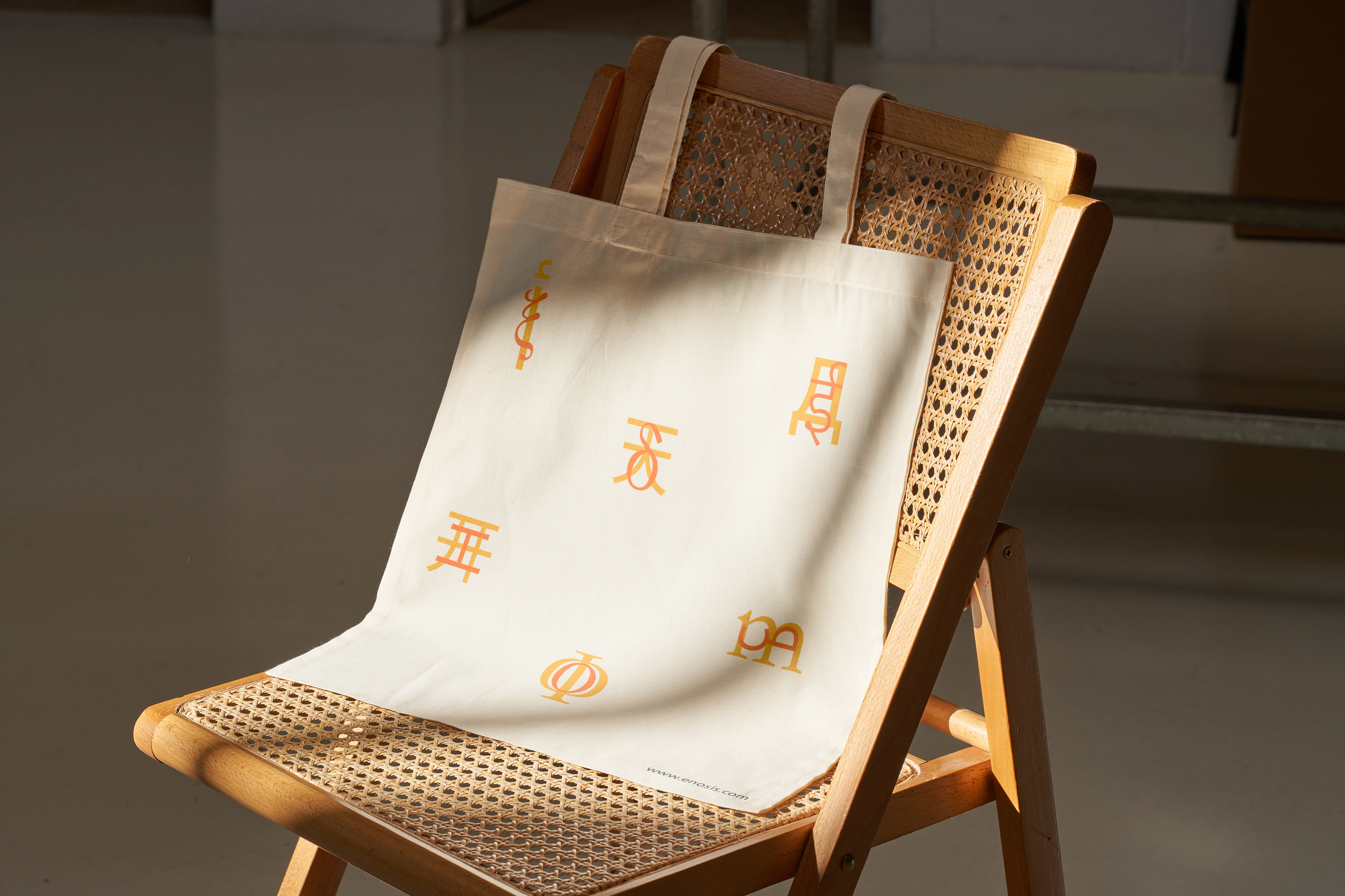
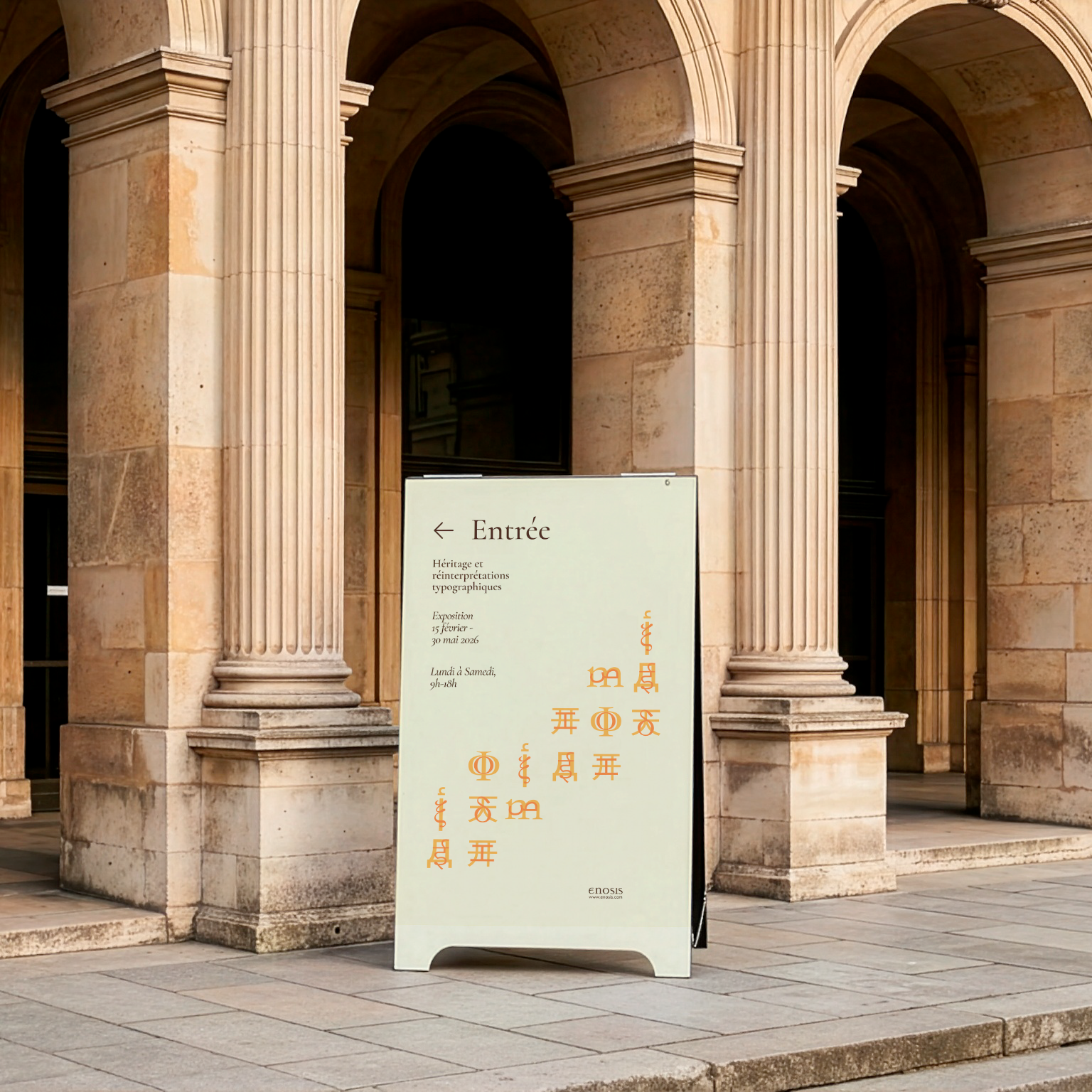
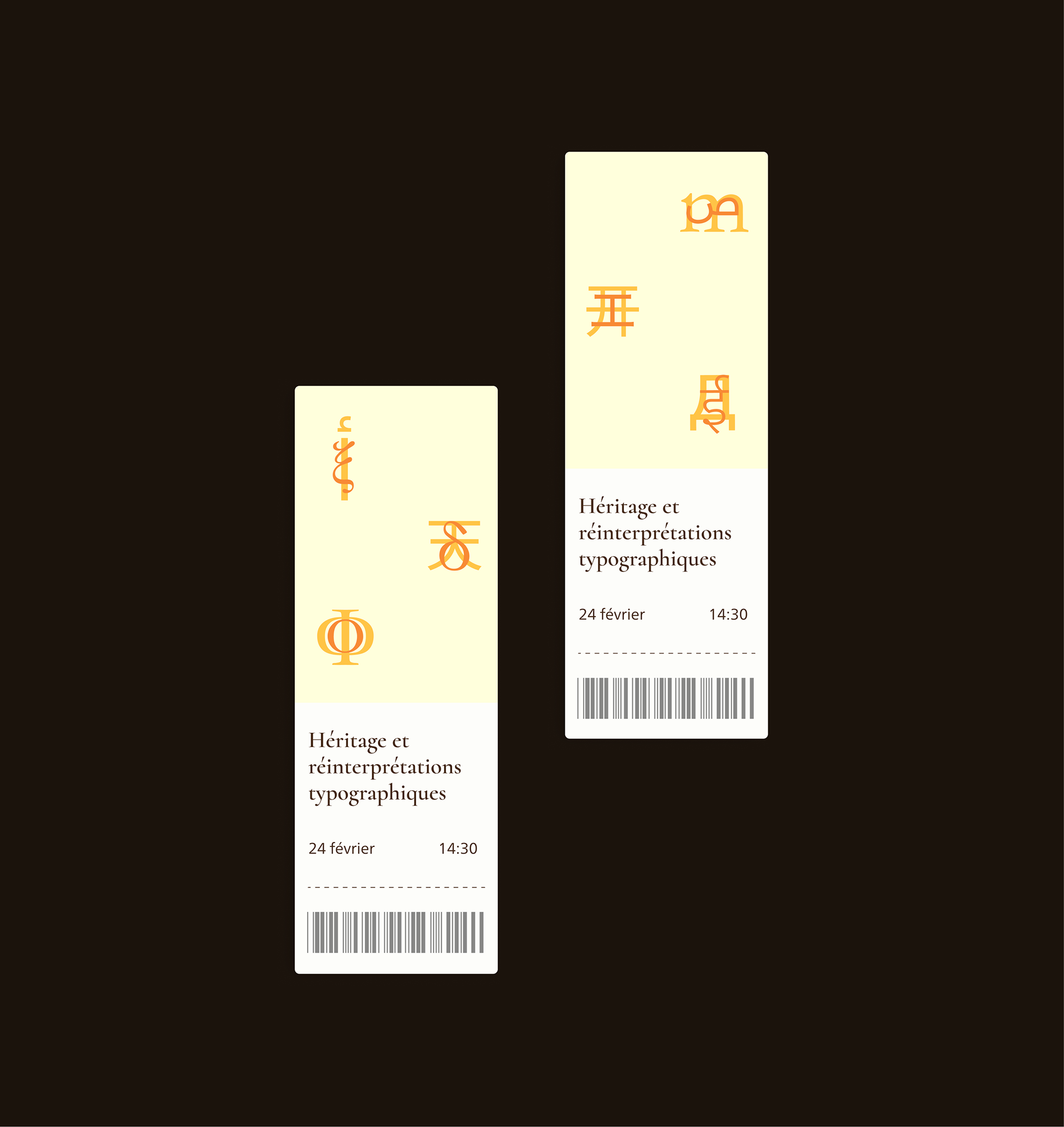
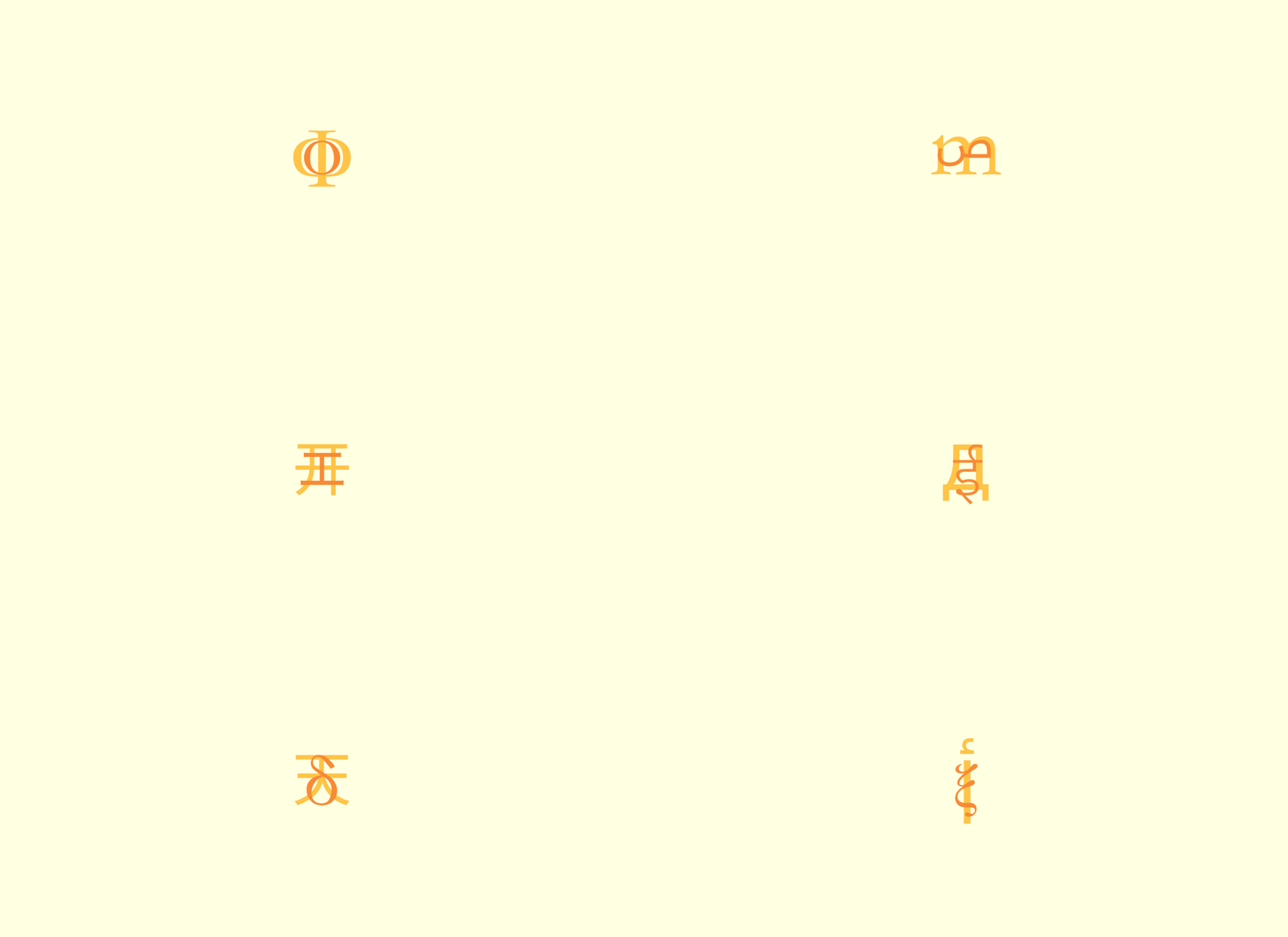
L’objectif de ce brief (fictif) était de concevoir une identité visuelle capable de traduire le concept central de l’exposition : l’union dans la rupture. Le visuel clé repose sur la superposition de lettres issues de langues différentes. Cette superposition met en évidence leurs contrastes tout en révélant certaines similarités, donnant naissance à une forme esthétique nouvelle, dans laquelle les caractères semblent entrer en dialogue. Chaque signe conserve sa singularité tout en participant, avec les autres, à la construction d’un langage visuel commun et modulaire.
Enosis est un collectif engagé pour la valorisation et la reconnaissance des arts ethniques, organisant tout au long de l’année des expositions thématiques. Héritage et réinterprétations typographiques est une exposition visant à promouvoir les créations de caractères internationaux à travers des travaux graphiques réalisés par des designers émergents du monde entier, membres du réseau du collectif. Au-delà de la mise en valeur de la singularité des différents systèmes d’écriture, l’exposition propose un regard nouveau et cosmopolite sur la création typographique contemporaine.
L’objectif de ce brief (fictif) était de concevoir une identité visuelle capable de traduire le concept central de l’exposition : l’union dans la rupture. Le visuel clé repose sur la superposition de lettres issues de langues différentes. Cette superposition met en évidence leurs contrastes tout en révélant certaines similarités, donnant naissance à une forme esthétique nouvelle, dans laquelle les caractères semblent entrer en dialogue. Chaque signe conserve sa singularité tout en participant, avec les autres, à la construction d’un langage visuel commun et modulaire.
(EN)
Enosis is a collective committed to the promotion and recognition of ethnic arts, organizing thematic exhibitions throughout the year. Heritage and Typographic Reinterpretations is an exhibition aimed at showcasing international type design through graphic works created by emerging designers from around the world, all members of the collective’s network. Beyond highlighting the uniqueness of various writing systems, the exhibition offers a fresh, cosmopolitan perspective on contemporary typographic design.
The goal of this (fictional) brief was to create a visual identity capable of translating the exhibition’s central concept: unity through rupture. The key visual is based on the superimposition of letters from different languages. This layering highlights their contrasts while revealing certain similarities, giving rise to a new aesthetic form in which the characters appear to enter into dialogue. Each sign retains its individuality while simultaneously contributing, together with the others, to the construction of a shared and modular visual language.
Enosis is a collective committed to the promotion and recognition of ethnic arts, organizing thematic exhibitions throughout the year. Heritage and Typographic Reinterpretations is an exhibition aimed at showcasing international type design through graphic works created by emerging designers from around the world, all members of the collective’s network. Beyond highlighting the uniqueness of various writing systems, the exhibition offers a fresh, cosmopolitan perspective on contemporary typographic design.
The goal of this (fictional) brief was to create a visual identity capable of translating the exhibition’s central concept: unity through rupture. The key visual is based on the superimposition of letters from different languages. This layering highlights their contrasts while revealing certain similarities, giving rise to a new aesthetic form in which the characters appear to enter into dialogue. Each sign retains its individuality while simultaneously contributing, together with the others, to the construction of a shared and modular visual language.